
Designing dashboards today seems a very simple task, thanks to modern BI tools. However designing efficient dashboards that are useful and that people want to use is not the same story. A good dashboard must follow specific rules that our Data Artists experts explained in this webinar available in replay.

How to tell Data-Stories in your Dashboard?
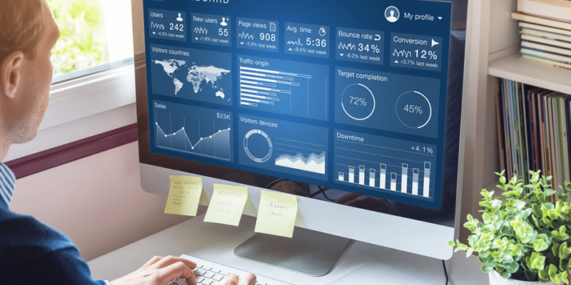
Does your dashboard tell data-stories today? Does it explain specific information so everyone can understand and use it? If not maybe you will need to go through some fundamentals. Before creating your Dashboard you must have in mind your audience, your KPI, your design, your layout, and your pattern visualization (gestalt), in this webinar in replay our Data Artist experts will discuss the best approach to create efficient Dashboards.
What you will learn in this webinar:
– What do I need to look for to prepare a perfect dashboard?
– What is your audience and what is your value proposition? What about your KPI, what is their level of importance?
– How to organize information in my dashboard?
– What should you do to get a better design for a better understanding?
– A short introduction to Data Visualization
– A full session with real life use-cases.


Your email address is only used by Business & Decision, the controller, to process your request and to send any Business & Decision communication related to your request only. Learn more about managing your data and your rights.