
In a world where the amount of data is growing exponentially, it is becoming increasingly difficult to design efficient and effective dashboards. How then can marketing managers, department heads and leaders use Dataviz to successfully conceive and create efficient, easy-to-read dashboards?

Do the following remarks sound familiar to you?
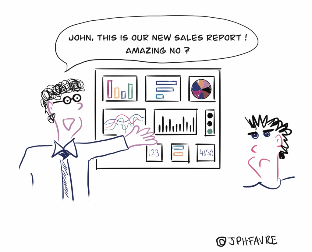
- “I want ALL the questions to be answered by a single dashboard.”
- “Quite frankly, the reporting that we have just received is already giving me a headache, how about you?”
- “As far as I am concerned, it’s simple, I export the data from his(her) dashboard into Excel, rearrange everything the way I prefer it and then make my own presentation, it is much simpler.”
- “I would love to have a dashboard that resembles the one in my car. It tells me everything I need to know, speed, petrol, etc. without drowning me in useless information.”
This imaginary (or not) discussion is one that could be taking place right now in any company. In a world where the amount of data is growing exponentially, it is becoming increasingly difficult to create an EFFICIENT dashboard and not get carried away by this familiar brief from managers: “I want ALL the questions to be answered by a single dashboard!”
How to reduce the stress level associated with opening your dashboards?
In order to limit the adverse impacts of the approach, it is essential that we get back to basics. I hereby invite you to discover the five key elements that will help you create the most comprehensive dashboard possible; one that is both easy to understand and visually pleasant.
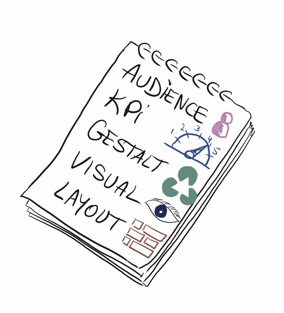
These five elements that should be of particular interest to you are: audience, KPIs, Gestalt, visuals, structure.
1. Audience
The subject seems so obvious… that it often gets sidelined. To design an effective dashboard, it is imperative that a number of questions be directly posed about the audience.
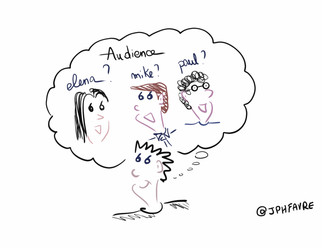
- Who is the information for?
- How much time will the recipients likely devote to this reporting?
- What does the audience expect from this dashboard?
- What is the added value?
- Is it “just another dashboard” or “a dashboard that will help make informed decisions”?
Action: when you open your dashboard, can satisfactory answers be given to all of the above-listed questions?
2. KPIs
If the audience gives clear indications regarding our target and we have sufficiently challenged it on key issues it may have, KPIs or key performance indicators will rapidly surface during discussions. These will not necessarily be organised in order of importance, but will already be present. You must always pay attention to the number of these indicators as we tend to want to impress – and show off by displaying everything on the screen – but this is not the right approach to Dataviz.
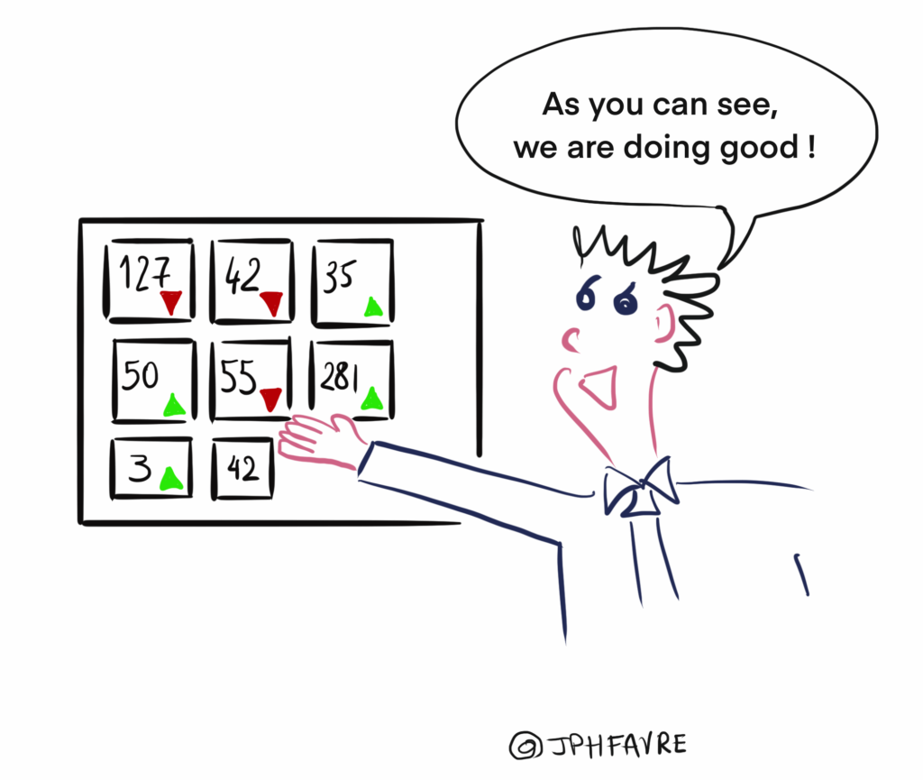
I would rather have 3 important KPIs that help move my project forward than 10-12 KPIs that will only drown me in information.
Action: what is your approach regarding KPIs? How many KPIs do you need to monitor your activity? Are they organised in order of importance?
3. Gestalt
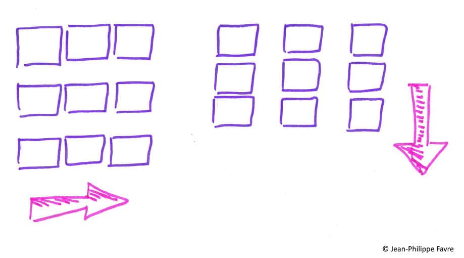
“Gestalt” refers to principles of information perception and representation that date back to the 1920s. So, what does this German term have to do with dashboard creation? Well, quite a lot actually! For instance, the principle of proximity holds that we tend to group together information that are close to each other into one unique message. As such, it is key to organising your various graphs and indicators.
Another principle is that of similarity. Our brain is constantly looking for patterns in order to organise information reading. So, if you start to use a specific colour when referring to the current year, “blue” for example, you should make sure that in all of your different dashboards, “blue” is always used to refer to the current year.
Action: look into these Gestalt principles as used in data visualisation and mirror these principles in your dashboard. Does all of this make sense?
4. Visuals
The visual aspect is another essential element whose importance is often underestimated. It is usually the one relegated to the “end of the process,” i.e. if the time allocated to create the dashboard is sufficient, then I will pay more attention to it. What we are talking about here, is choosing the right graphical representations, the right colours as well as the way to use them and all these little things which, put together, will tell a true story. This is for me a real hobbyhorse as we do not want our dashboards to look like Christmas trees. So, we must streamline, rethink and refine the visual aspect, keeping in mind that “less is more”.
Action: look at your dashboard and count the colours: how many are there? Does it form a coherent whole? What do you think of the charts? Can they be understood? Read?
5. Structure
Without structure, the story cannot be understood! It would be like reading the chapters of a book in the wrong order. The ideas are there, we can highlight the key points, but we are unable to understand the whole picture.
Structure is extremely important for dashboards. Without structure, a dashboard is like one of those interactive gamebooks: a book in which you find yourself in different situations depending on your choices but instead of making choices, you read the various articles directly end-to-end and this does not make any sense whatsoever anymore.
Action: when you read your dashboard, do you feel like you are reading a gamebook? Or can you follow a smooth line of reasoning?
Where to start to set up an efficient dashboard?
These 5 elements are key to creating an efficient dashboard. The next time you open a dashboard, simply remind yourself of these 5 points and all associated questions.
If the answers to the questions are not satisfactory, or if you identify with the dialogue mentioned above, then the issue is quite probably one that concerns you.
- Draw up a list of departments facing this type of issue
- Organise a brainstorming workshop for the departments in question
- Avail yourself of the services of a Data Artist, if necessary
Data Artists – whose role is to visually and concretely showcase data – have the expertise to help you quickly solve the problem.
In a future article, I will get into the specifics of the proven method used by our consultants to collect needs. Collecting needs within the context of dashboard design, is not as simple as making a list. No, to be efficient, you must structure your approach, not get bogged down in details and most importantly…challenge, always challenge your audience.


Your email address is only used by Business & Decision, the controller, to process your request and to send any Business & Decision communication related to your request only. Learn more about managing your data and your rights.