
The Python integration in Power BI is a huge step forward from Microsoft. It opens a wide range of possibilities in terms of extracting and cleaning your data as well as creating nice-looking and full customized visuals. Let’s see how it works and how to set-up your Python environment in your Power BI Desktop. As learning by examples is always more telling, we will see with the use-case of the road accidents in Geneva to illustrate it. So, let’s see the steps to build your report.

Time to create your report: 1 hour
Objective: Understand the PowerBI-Python integration
With the use case: Analysis of road accidents in Geneva
Source : « Système d’information du territoire à Genève (SITG), extracted on 03.01.2020 »
1. Download the dataset
The dataset about the number of road accidents in Geneva, which will allow you to build the report, can be found on the opendata.swiss.
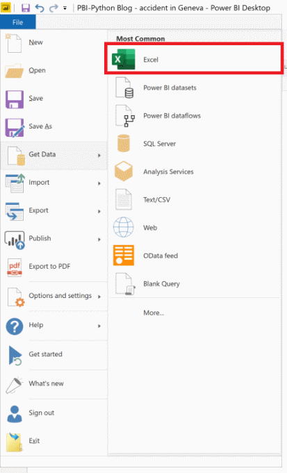
2. Import the dataset into PowerBI
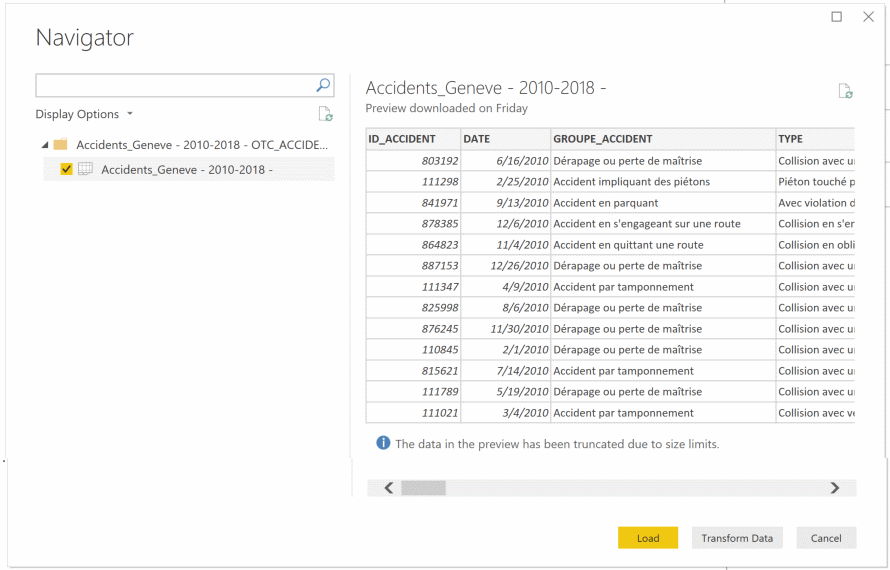
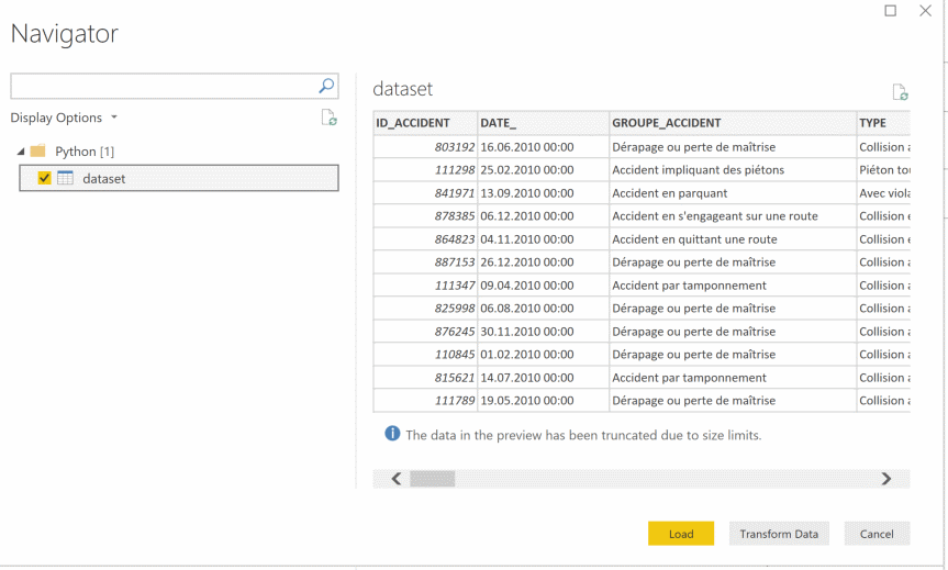
Go to File -> GetData -> Excel and connect to the dataset. Select the table “Accidents_Geneve – 2010-2018” and Click on Load:
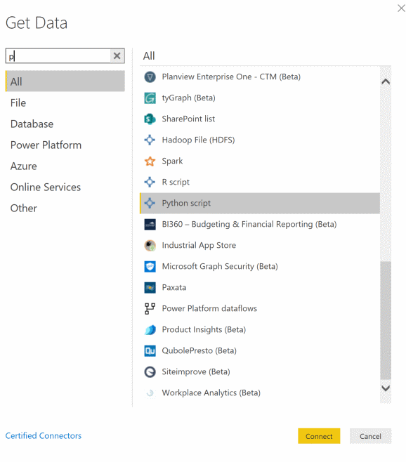
You can also import your data running a Python script directly.
In PowerBi select Get Data > More…., then look up Python script and select connect:
- Copy/paste this script in the Python script box, adapting the path to your local file location:
import matplotlib.pyplot as plt
import numpy as np
import pandas as pd
dataset = pd.read_csv(“C:\\Users\\Username\\Desktop\\Accidents_Geneve – 2010-2018 – OTC_ACCIDENTS – OpendataSwiss.csv”, sep= “;”, encoding = “iso8859_2”)
You may also need to adjust your csv separator and encoding to your local configuration.
Select the table “dataset” and load it.
3. Install Python packages
Make sure you have python installed (can be achieved via anaconda).
Install Pandas + matplotlib packages (they are necessary for python visual to work) + numpy + seaborn packages (they are nice to have good looking reports).
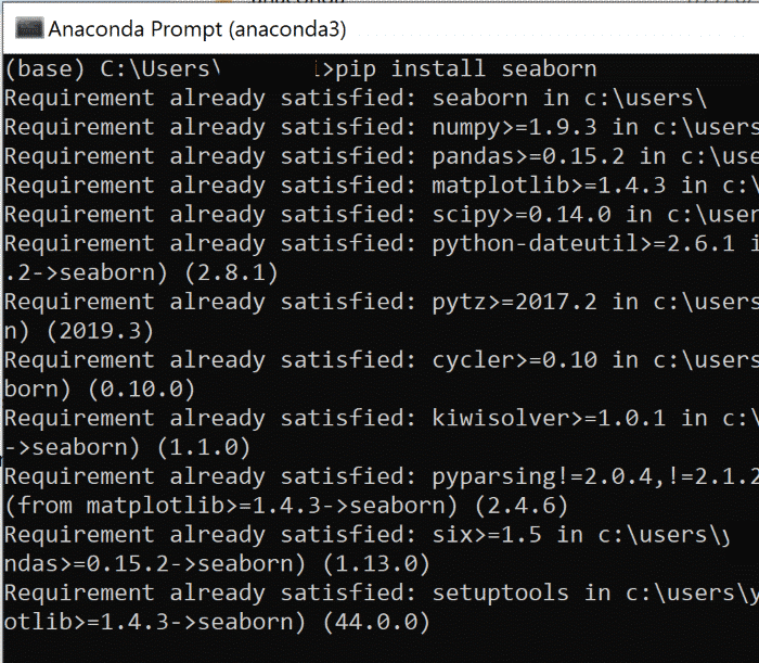
- Open your Python terminal and execute the following code:
pip install pandas
pip install matplotlib
pip install numpy
pip install seaborn
• Pandas is used for the interaction with data in tabular format,
Matplotlib as the Standard ploting library,
Numpy to deal with arrays and matrix,
and Seaborn to have nice looking charts.
• In case you don’t have pip installed, check here to see how to install it.
4. Make Python work in PowerBI!
Verify Python is linked to the correct version and to the correct editor:
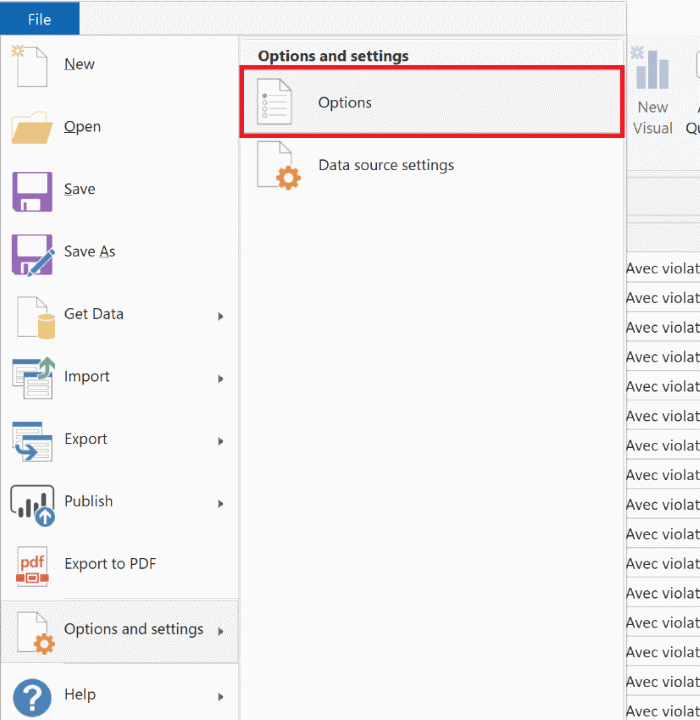
- Click on File -> Options and settings -> Options
- Under Python scripting, verify that the path to your Python home directory is correct and corresponds to the right version of Python. To check, just execute the code python in you python terminal to see which version is running.
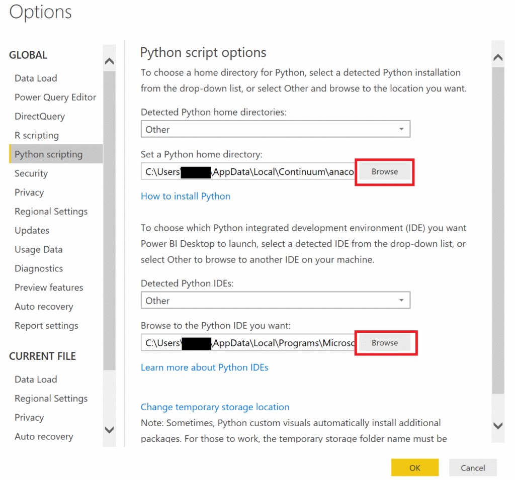
Do the same with your Python IDE path (it will be more convenient to type your code afterwards).
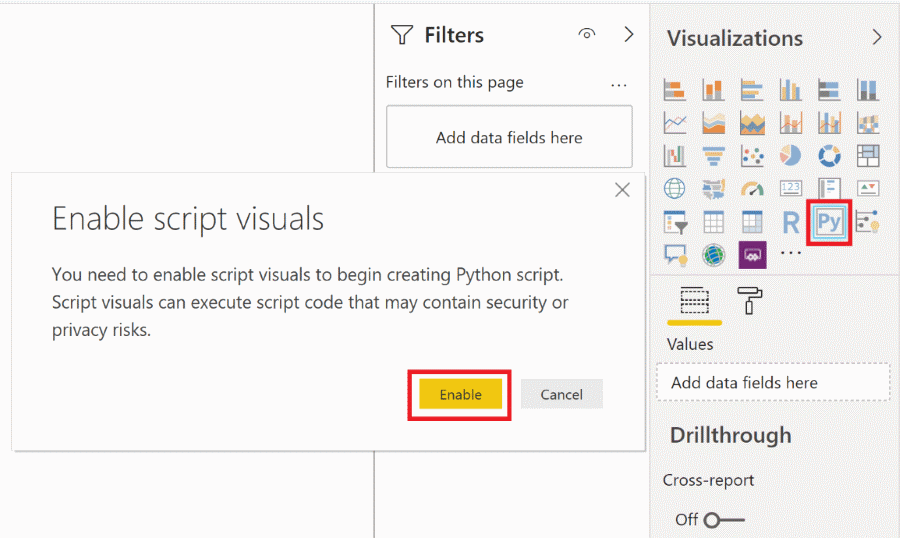
5. Use Python Visual
Click on the Py Visual icon. Enable Python in PBI:
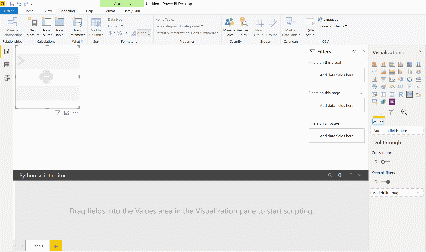
By default, you can’t write any script before drag and dropping a dimension:
So, drag and drop a measure: ANNEE, into values:
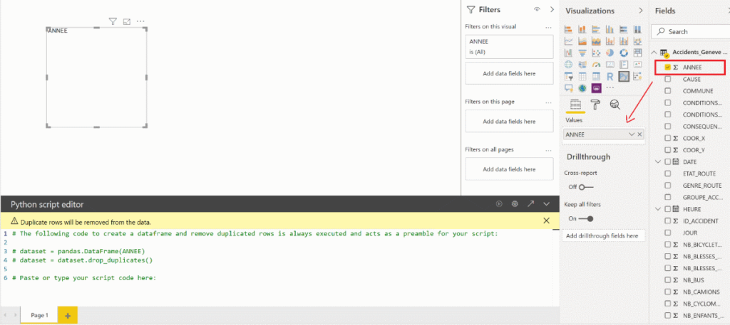
PowerBI automatically uses pandas to manage the dataset and removes duplicates.
- Field added by default by PowerBI:
# dataset = pandas.DataFrame(ANNEE)
# dataset = dataset.drop_duplicates()
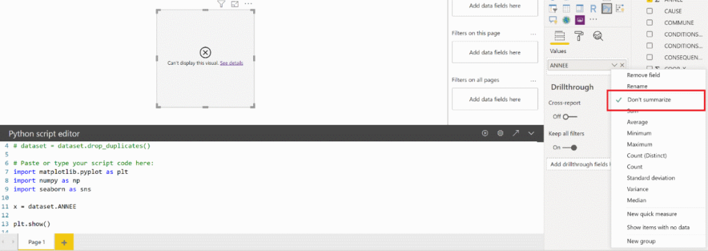
- You can only use dimensions that you have added to the “values” section. Make sure it is added whenever you want to use one. Make sure it is added as well in the field populated by default by PowerBI:
#dataset=pandas.DataFrame(Dimension1, Dimension2)
- If you need all the rows of your dataset, remove the row
#dataset=dataset.drop_duplicates()
Which is added by default or add an index field to your dataset. All rows will then be considered as unique and none will be grouped.
Make sure your values are on “Don’t summarize” format:
Drag your measure NB_BLESSES_LEGERS into values. Select “Count” instead of “Don’t summarize” for this dimension. Enter this python code at the end of your Python script editor:
import matplotlib.pyplot as plt

import numpy as np

import seaborn as sns
x = dataset.ANNEE
 y = dataset.NB_BLESSES_LEGERS
plt.bar(x, y, color="purple") # call a bar chart with x and y axis and set the colorplt.show() # to be able to display the plot. If you don’t type this, an error msg will appear.
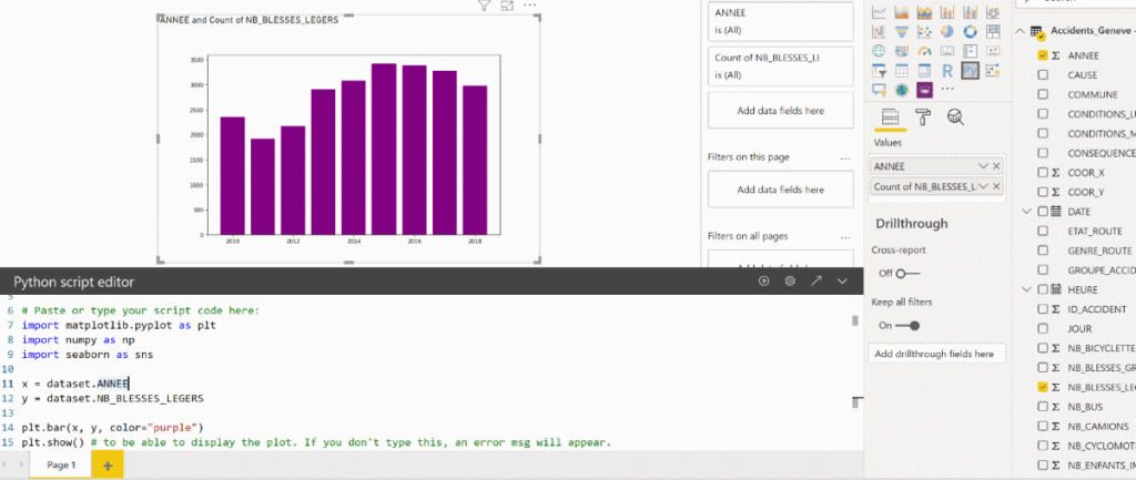
For more info on plt.bar() function: https://matplotlib.org/3.1.1/api/_as_gen/matplotlib.pyplot.bar.html
In case of issues in displaying the chart, DON’T PANIC! It happened to many others before you, we will fix it… this checklist can help you:

- Check that Power BI is linked to your correct Python path.
Go to File -> Options and settings -> Option. Click on Python scripting and change your Detected Python home directories to Other and browse the correct Python app.
(Note: if your Python app is on your folder “AppData” and you don’t see it, go to window -> show hidden files and folders and check show hidden files, folders and drives.
With Anaconda, my path looks like this:
C:\Users\Username\AppData\Local\Continuum\anaconda3\envs\PowerBI 35
- Check that your packages are correctly installed with pip and update them.
- Change your Power BI regional settings to English (United States). File -> Options and settings -> Option. Click on regional settings and change to English (United States). PowerBI may have some issues reading your data source file because of the way it interprets the format of your data.
- I noted some issues with Python 3.6 and 3.7. Try to install Python 3.5! And make sure then that your PowerBI is pointing on the Python3.5 version.
Note: Python visual requires you to display a visual i.e plt.show() or any equivalent.
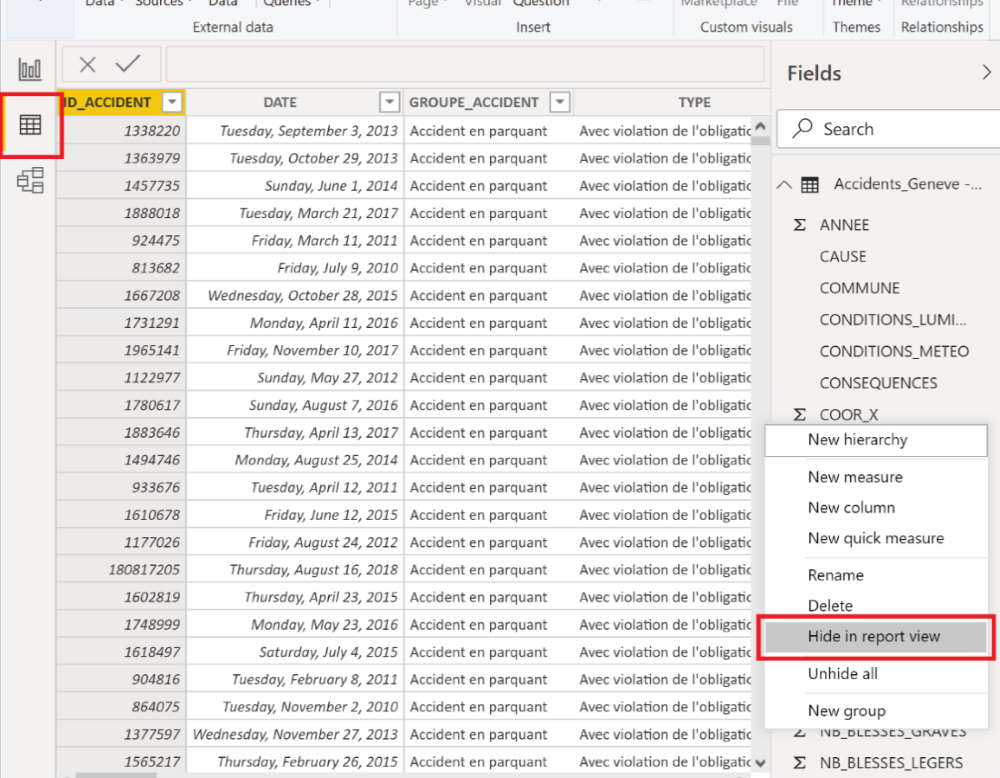
6. Format your dataset
To make it more convenient to work with your data, go to your “data” tab and hide the dimensions we won’t need. Just keep the dimensions:
HEURE, CAUSE, JOUR, ANNEE, ID_ACCIDENT, NB_TUES, NB_BLESSES_GRAVE.
All your dimension will still remain in your dataset but you won’t see the hidden ones:
Change the datatype of your measures to “Whole Number” if the auto-detected datatype detected it differently:
- Go to Data tab-> Modeling-> Data Type
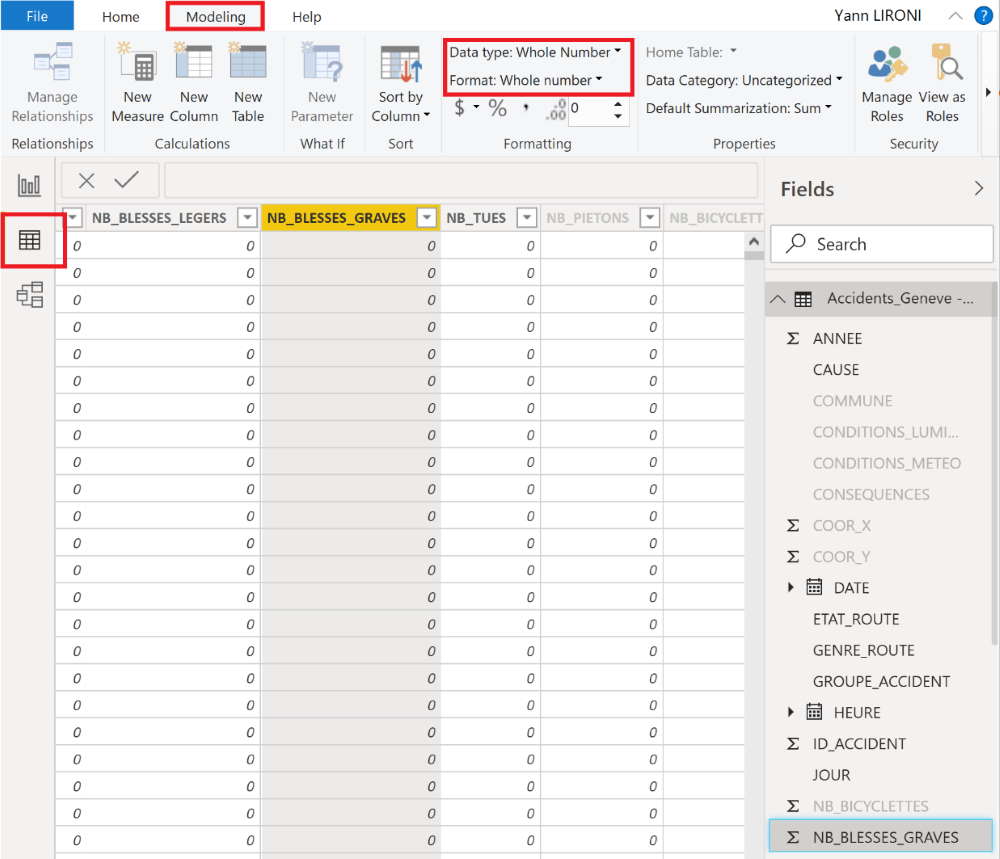
Do the same for the dimension HEURE and display it as Date/Time.
7. Create a nice-looking chart with Seaborn
Interaction:
You probably noticed that the charts created with Python visuals are not interactive and unformattable through PowerBI format functions. You will need to code it in you Python script. Nevertheless, if you click on other visuals, your Python visual will correctly be filtered.
Create the charts:
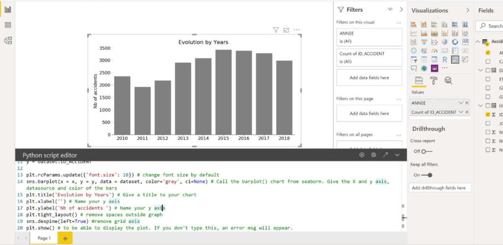
Now, it is time to create the chart to analyse the number of accidents in the Canton of Geneva from 2010 to 2018. Drag the dimension ID_ACCIDENT to “Values” and select “Count”. Then type this code in your PowerBI Python script editor:
import matplotlib.pyplot as plt

import numpy as np
import seaborn as sns
x = dataset.ANNEE
y = dataset.ID_ACCIDENT
plt.rcParams.update({'font.size': 18}) # change font size by default

sns.barplot(x = x, y = y, data = dataset, color='gray', ci=None)
 # Call the barplot() chart from seaborn. Give the X and y axis, datasource and color of the bars
plt.title('Evolution by Years') # Give a title to your chart
plt.xlabel('') # Name your y axis

plt.ylabel('Nb of accidents ') # Name your y axisplt.tight_layout() # remove spaces outside graphsns.despine(left=True) # remove grid axis
plt.show() # to be able to display the plot. If you don't type this, an error msg will appear.
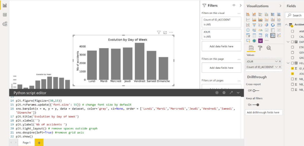
Same procedure for the analysis of the Days of the Week. Copy/paste this code:
import matplotlib.pyplot as plt
import numpy as np
import seaborn as sns
w = dataset.JOUR
y = dataset.ID_ACCIDENT
plt.figure(figsize=(30,15)) # change font size by default

plt.rcParams.update({'font.size': 55}) # change font size by default
sns.barplot(x = w, y = y, data = dataset, color='gray', ci=None, order = ['Lundi','Mardi','Mercredi','Jeudi','Vendredi','Samedi', 'Dimanche']) # Call the barplot() chart from seaborn. Give the X and y axis, datasource, color of the bars and order the week days.
plt.title('Evolution by Day of Week') # Give a title to your chart
plt.xlabel('') # Name your y axis
plt.ylabel('Nb of accidents') # Name your y axis
plt.tight_layout() # remove spaces outside graph
sns.despine(left=True) # remove grid axis
plt.show() # to be able to display the plot
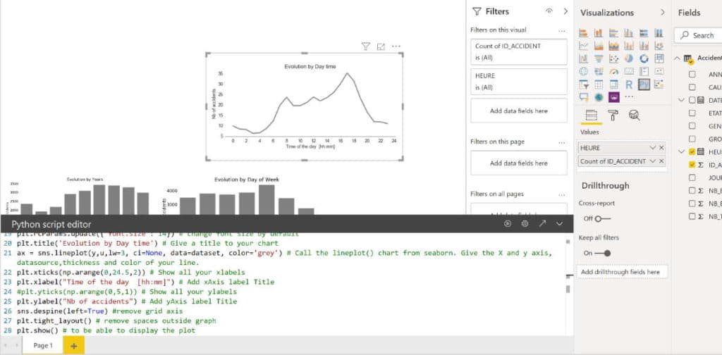
You might begin to get it now… Same procedure for the analysis of the number of accidents’ evolution by day time. Notice the import of the datetime package:
import matplotlib.pyplot as plt
import numpy as np
import seaborn as sns
from datetime import datetime
import pandas as pd
y = dataset.HEURE
u = dataset.ID_ACCIDENT
dataset['HEURE']=pd.to_datetime(dataset['HEURE'],format='%Y/%m/%d %H:%M:%S') # format your date datatype

y = dataset.HEURE.dt.hour # extract the hour of the day

sns.set_style("white")
plt.rcParams.update({'font.size': 14}) # change font size by default

plt.title('Evolution by Day time') # Give a title to your chart

ax = sns.lineplot(y,u,lw=3, ci=None, data=dataset, color='grey') # Call the lineplot() chart from seaborn. Give the X and y axis, datasource,thickness and color of your line.

plt.xticks(np.arange(0,24.5,2)) # Show all your xlabels

plt.xlabel("Time of the day [hh:mm]")# Add xAxis label Title
plt.ylabel("Nb of accidents") # Add yAxis label Title
sns.despine(left=True) # Remove grid axis

plt.tight_layout() # Remove spaces outside graph

plt.show() # to be able to display the plot
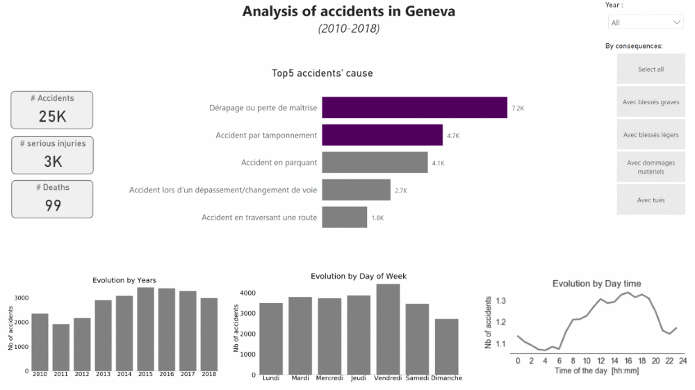
Let’s create the last chart with the ‘clustered bar chart’ proposed by PowerBI.
First, create a new measure CountAccidents. Click on Modeling->NewMeasure. Create the measure CountAccidents=COUNTROWS(‘YourDatasetName’). Then, select the ‘clustered bar chart’ and drag GROUPE_ACCIDENT to Axis and CountAccidents to Value.
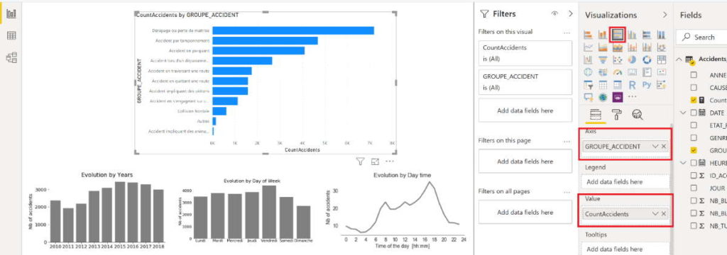
In the filter area, under filter type, select Top5 items; by value count of ID_ACCIDENT. It will display only the top5 causes sorted by the number of accidents.
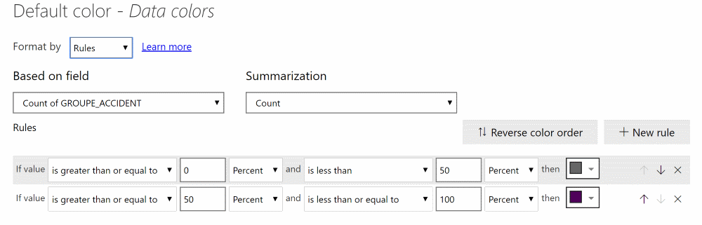
Click on the format selection of the visual to change the data color. Under Data colors, select conditional formatting and format by Rules. Enter the following parameters or the one you prefer and hit OK.
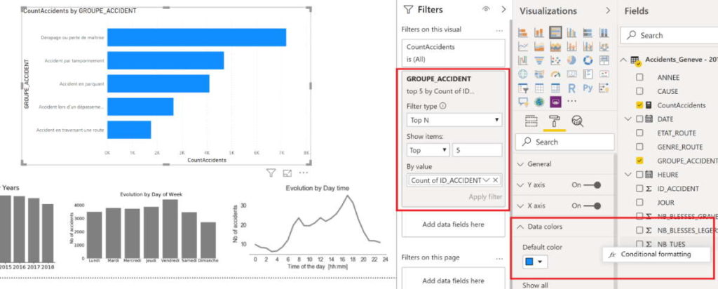
It is time to fine-tune the chart. Under the format section of your visual, change the Title, remove the grid, remove the X axis, display the data label and adjust the size of the text.
Create the Card KPI:
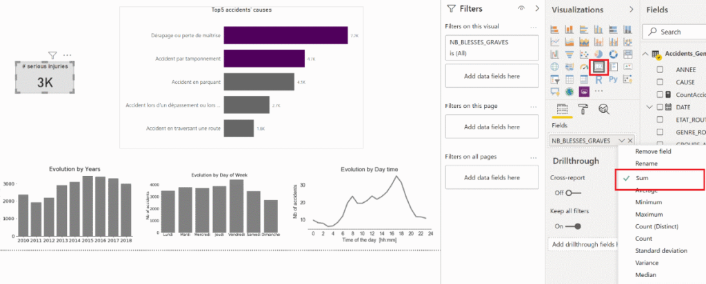
- Add the “Card” visual. Drag the dimension NB_BLESSES_GRAVES under Fields and select the SUM data type.
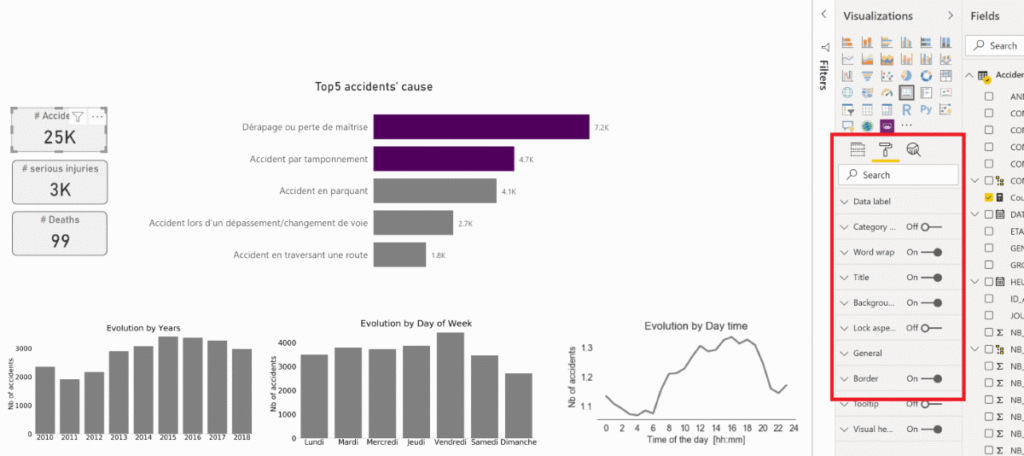
- Under the Format tab of the visual, add a grey background, a black border with radius and a title. Remove the Category label
Copy-paste the KPI, changing the Field NB_BLESSES_GRAVES by NB_TUES and CountAccidents, adapting the title of the KPI accordingly.
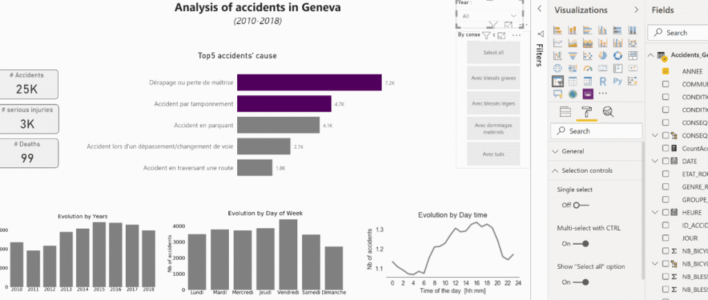
Add a Title and the filters to your report:
- Add a Text Box component and create the title “Analysis of accidents in Geneva (2010-2018)”
- Add the Slicer component, select the dimension CONSEQUENCES as Field. Do the same with the dimension ANNEE and display it as you prefer to see it.
Congrats! You just finished to create your nice PowerBI report using Python 😊
Now that you know how to use your Python integration in Power BI, the possibilities to customize your visuals are endless to build amazing dashboards! We are looking forward to having Python interactive graphs developed by Microsoft to gain more flexibilities for the end-users. Learn more about how to design efficient and decision-oriented reports.
To go further
- Microsoft doc on how to start with your Python visual
- To download the .pbix file
- To download the dataset
Source : Système d’information du territoire à Genève (SITG), imprimé et/ou extrait en date du 03.01.2020 » - Doc for Seaborn and Mathplotlib charts


Comment (1)
Your email address is only used by Business & Decision, the controller, to process your request and to send any Business & Decision communication related to your request only. Learn more about managing your data and your rights.
Shounak